Guide to Japanese Candles: how to read the chart, understand price movement, and build levels
If you are starting to learn trading, understanding Japanese candles is the foundation without which it is impossible to analyze the market. A candlestick chart reflects the battle between buyers and sellers, shows market sentiment, and forms key levels from which price reacts.
In this guide you will learn:
- what candles are and how price is formed;
- how to read the chart and see movement;
- how to build support and resistance levels;
- how to find trends, zones, and ranges.
1. What candles are and how price is formed
Each candle on the chart is the result of the battle between buyers and sellers over a specific period of time.
When buyers dominate — price rises.
When sellers are more active — price falls.
Candles are formed from many small price changes — ticks. One tick = one real trade in the market. From them, a candle is formed for:
- 5 seconds,
- 10 seconds,
- 1 minute,
- 5 minutes,
- 1 hour, etc.
Below is an example of a line chart, also called a tick chart (on the left), on the right is another type of chart — a candlestick chart, timeframe 1 minute: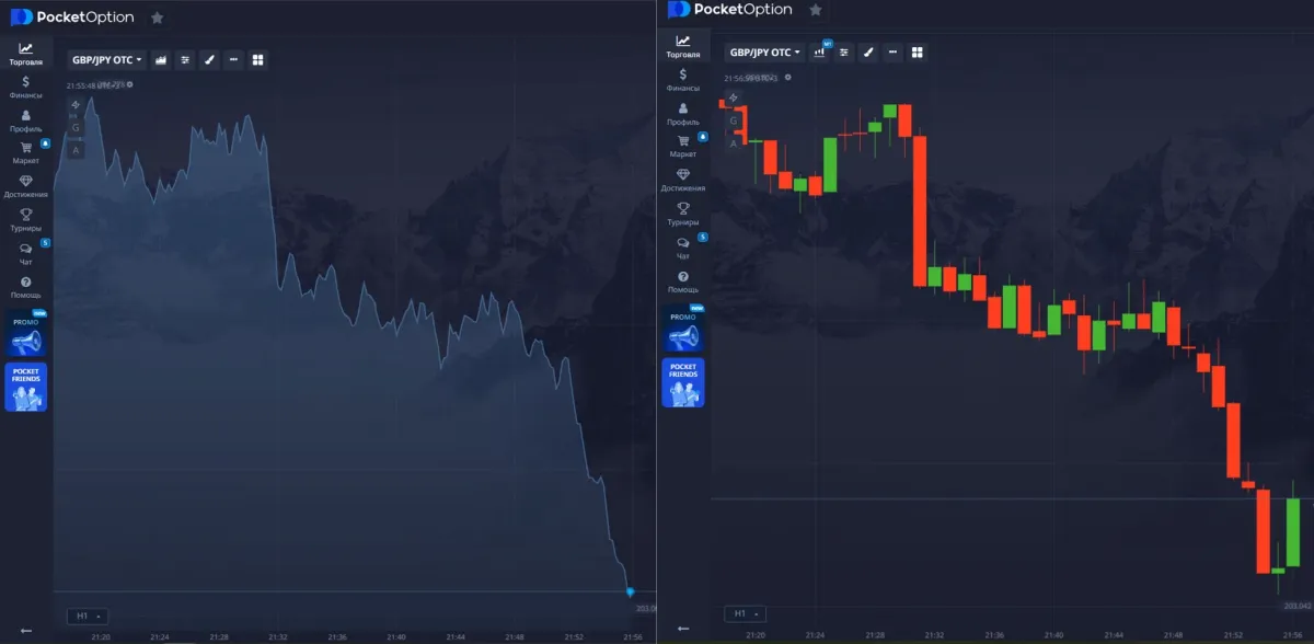
2. Structure of a Japanese candle
Each candle consists of a body and shadows (wicks).
Candles can be different colors, depending on the terminal (trading screen):
- Body — the rectangular part on the chart in green/red color, the range between the open and close price.
- Green / white candle — price has risen (bullish candle).
- Red / black candle — price has fallen (bearish candle).
- Shadows — the lines above and below the candle body, the maximum and minimum values reached by price inside the candle.
In the screenshot below, arrows show 1 - Candle bodies, 2 - Candle shadows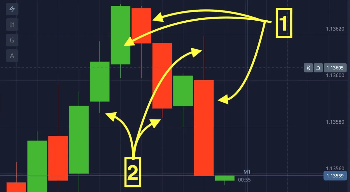
📍 Example:
- price opened at the bottom,
- went up (bottom-to-top) — the body became green,
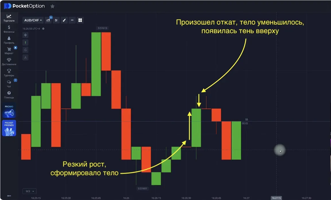
- but then a sharp pullback down occurred — a long upper shadow appeared.
The longer the shadow — the stronger the market reaction to the level.
3. How candles of different timeframes are formed
- 1 second consists of ticks (buys/sells in a moment of time)
- 1 five-second candle = 5 one-second candles
- 2 five-second candles = 1 ten-second candle
- 6 ten-second candles = 1 M1 candle (one minute)
- 60 M1 candles = 1 H1 candle (one hour)
In other words, the chart consists of “candles inside candles”.
Lower timeframes form higher timeframes, and higher timeframes show key levels and global moves.
In the example below you see an H1 candle, which equals 60 M1 candles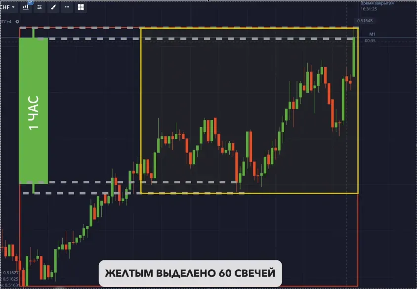
4. What support and resistance levels are
This is one of the basics of chart analysis.
Support level
This is the “floor” of the market.
- When price falls, then reverses and goes in the opposite direction, a level is formed.
- If price reverses and goes back to a level formed earlier, bounces off this level — it holds the price, not letting it fall further, thus a stronger level is formed.
Resistance level
This is the “ceiling” of the market.
- When price rises, then reverses, an upper level is formed and this level is called resistance.
- When price comes back to this level and hits it — it (the level) prevents it from breaking further, a bounce from this level occurs. After touching, price may go down.
Support and resistance levels are built by minimum and maximum points respectively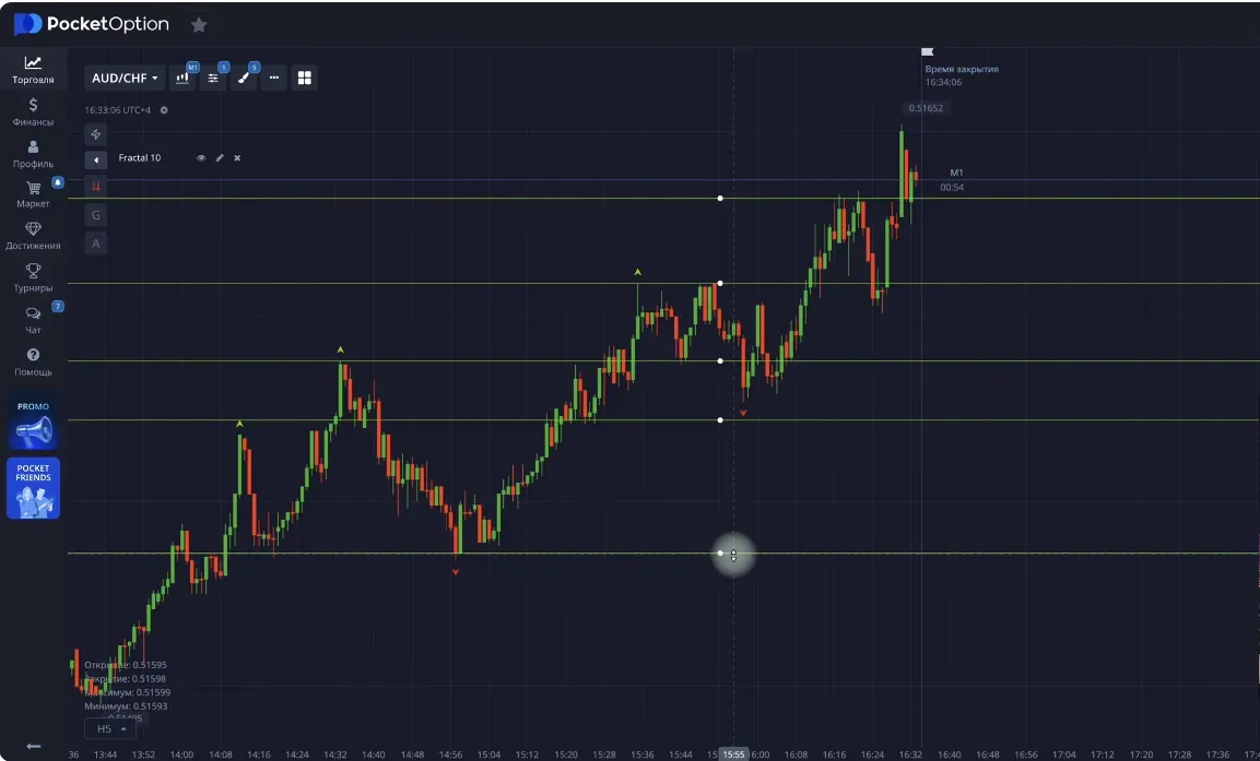
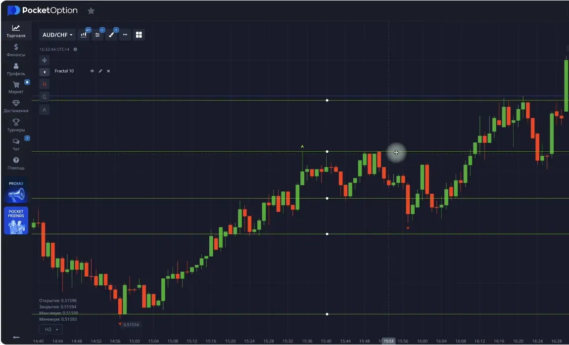
5. How to find levels on the chart
The most visual tool is the Fractal indicator.
By default, the parameter = 2:
- Two candles on the left and right that are lower/higher than the point relative to any candle — form a fractal (a level).
To see key levels — set period 10.
Then only important peaks (resistance) and troughs (support) will be displayed.
How to build a level manually:
- Turn on fractals (period 10).
- Find areas where price reacted many times.
- Draw a horizontal line through these points.
- The more touches to the drawn line by candle bodies or shadows — the stronger the level.
- Lines are drawn along the edges of candle bodies or shadows
- Each trader draws levels in their own way, there is no 100% single and perfect construction, small inaccuracies are acceptable
6. How levels work
Price can:
- bounce from a level — movement is preserved (trend is maintained);
- break the level — and then it changes its role (support turns into resistance and resistance into support).
📍 Example:
- the level acted as resistance (it was above),
- price broke it (went higher),
- now this level has become support (the level was above, now it is below).
This is a sign of a trend change (trend reversal).
In the screenshot below you can clearly see the place where the resistance level turned into a support level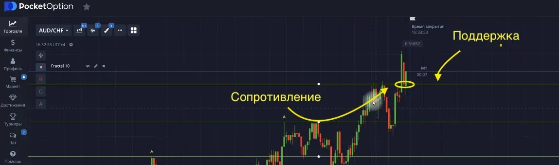
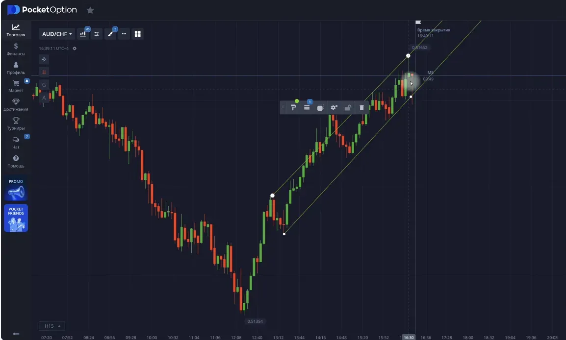
7. How to build trend lines and channels
Trend lines
- For an uptrend — along lows (bottom points).
- For a downtrend — along highs (top points).
This line shows direction and helps find entry points.
- An entry point appears when price approaches the trend line and potentially indicates that the correction is ending and the trend movement upward can continue.
Trend channel
Add a second parallel line — you get a price channel.
- Near the upper boundary — traders often look for sells.
- Near the lower boundary — buys.
- In the screenshot below you see a price channel. When the chart approaches and touches the upper line, you can sell, when it touches the lower line — buy. However, in an ascending channel only buys are recommended, selling can be more risky due to a prolonged trend
8. Sideways movement (range)
A range (flat) is movement within a narrow corridor.
To highlight a range:
- Draw two horizontal lines along the upper and lower shadows.
- Wait for a breakout of one of the borders.
📌 If price breaks upward — growth most often follows.
📌 A breakout downward — a possible fall.
A breakout from a range often gives a strong impulsive move.
On the chart we see a prolonged range, then on news it is broken by an impulse (1), after which there is a return into the channel (2) and then the exit from the channel (3) continues the new uptrend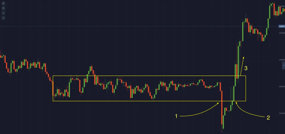
9. Levels and trends through the eyes of a trader
As mentioned before, there is no single correct way to build levels. Each trader sees the chart in their own way.
The main points:
- look for zones where price reacted several times,
- do not overload the chart with unnecessary lines,
- use key levels.
Over time, your eye will start to “catch” important zones — and you will begin to read the chart confidently. Everything takes time and patience.
10. Additional tools
Additional methods you can learn later:
- Fibonacci (Fibo Levels) — for forecasting corrections;
- parallel channels — to assess trend strength;
- rectangles — to highlight accumulation zones.
Example of Fibonacci levels
✅ Conclusion
Japanese candles are the language of the chart.
Once you master them, you’ll start to understand the market much more deeply:
- analyze not just one candle, but the whole context (different timeframes and levels);
- build levels based on history;
- watch how price reacts;
- practice on a demo account.
🎓 In the next guide we will look at indicators and oscillators:
what they show, how to use them, and how to avoid false signals.
Guide: how to work with oscillators and indicators
Simple explanations for beginners: how indicators and oscillators differ, how they work, which settings to use, and how to apply them in trading binary options and on Pocket Option.
Complete overview of the Pocket Option platform — a beginner’s guide
A detailed overview of the Pocket Option platform: demo account, bonuses, technical analysis, tournaments, indicators, statistics, and social trading. A helpful guide for those starting with binary options.